Coty | E-commerce

UX | UI

Art Direction

Style guide

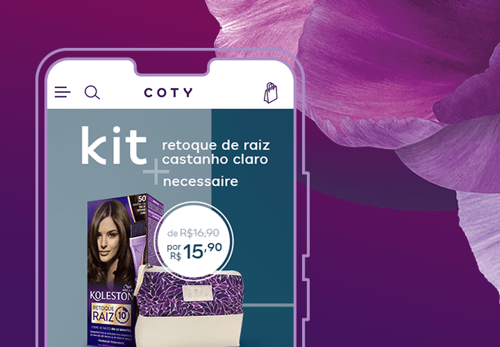
imagem principal apresentando duas telas do site da lojas virtual

Coty is a multinational beauty company founded in France in 1904. It's one of the world's largest companies in the cosmetics, fragrance, and personal care industry, with a vast portfolio of iconic brands.

The main challenge was to create a shopping experience that allowed users to quickly find products, reducing the number of steps required to complete a purchase.

My role

  • Research on existing data and current market presence;

  • Development of the information architecture to understand user journeys;

  • Competitor research to understand category patterns and identify differentiation opportunities;

  • Creation of the visual interface with a focus on hierarchy and usability principles;

  • Creation of the style guide, prioritizing alignment with the brand identity guide, consistency, and ease of development;

  • Art direction for seasonal campaigns featured on the website.

UX | UI

I created this architecture, which allowed us to understand the page hierarchy and where each piece of content would be placed. It also made it easier to visualize and later map out the main user journeys.
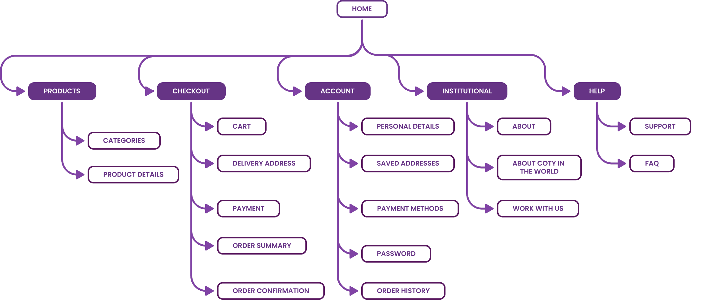
sitemap com descrição das páginas do site e onde se encontram
página de categoria de esmaltes
página de lançamento de produtos de uma coleção com a imagem de uma mulher com cabelos tratados
página do produto específico, um creme de tratamento da marca monange
página de categoria de esmaltes
página do produto específico, um creme de tratamento da marca monange
página de lançamento de produtos de uma coleção com a imagem de uma mulher com cabelos tratados

In addition to the product pages, I also designed key steps in the purchase and post-purchase journey. These interfaces were built to reduce friction and increase confidence during conversion. They also aimed to deliver a consistent experience after order completion.

Checkout

In the checkout, both the Header and Footer have fewer elements. This keeps the focus on payment method icons and security badges that reinforce the site's trustworthiness. The 'Continue' button is displayed in a larger size to stand out and highlight the user's main action.

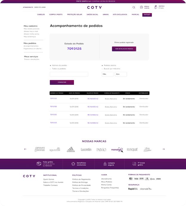
Order history

On this page, the status of the most recent order is highlighted, appearing as the first box with a button for more details, since research showed that the user's top need was to track their most recent order.

Order status

The user can easily view the order status, as the text is highlighted with a specific weight and color. With a focus on conversion, the 'Reorder' button stands out right at the beginning of the content.

My account

The links are categorized by theme to improve findability. Icons were also applied to help identify content and bring a more relaxed feel to the page, increasing customer satisfaction.

4 páginas de apoio na compra: estado do pedido, checkout, minha conta e acompanhamento dos pedidos

In addition to the product pages, I also designed key steps in the purchase and post-purchase journey. These interfaces were built to reduce friction and increase confidence during conversion. They also aimed to deliver a consistent experience after order completion.

Checkout

In the checkout, both the Header and Footer have fewer elements. This keeps the focus on payment method icons and security badges that reinforce the site's trustworthiness. The 'Continue' button is displayed in a larger size to stand out and highlight the user's main action.

Order history

On this page, the status of the most recent order is highlighted, appearing as the first box with a button for more details, since research showed that the user's top need was to track their most recent order.

Order status

The user can easily view the order status, as the text is highlighted with a specific weight and color. With a focus on conversion, the 'Reorder' button stands out right at the beginning of the content.

My account

The links are categorized by theme to improve findability. Icons were also applied to help identify content and bring a more relaxed feel to the page, increasing customer satisfaction.

Style guide

I established visual guidelines to promote consistency across interfaces, optimize the development of new screens, and make the product more scalable.

diversos componentes como botão, campos de preenchimento e cart mais paleta de cor do style guide

Let's work together?

Reach out! I'd love to chat.

katia.rlibanio@gmail.com

ilustração de uma flor com olhos e boca

Katia Libanio ©2026

All rights reserved.

Let's work together?

Reach out! I'd love to chat.

katia.rlibanio@gmail.com

ilustração de uma flor com olhos e boca

Katia Libanio ©2026

All rights reserved.

Let's work together?

Reach out! I'd love to chat.

katia.rlibanio@gmail.com

ilustração de uma flor com olhos e boca

Katia Libanio ©2026

All rights reserved.